Flagship smart-phones have been getting progressively larger. My first high-end Android device was a Samsung/Google Nexus S, which was comparable to an iPhone 3GS in dimensions. By modern standards it is chunky, yet it remains a good tradeoff between screen size, pocketability, and handling.
The two phones I’ve owned since the Nexus S have had progressively larger screens – I went to a Galaxy SII, and then a Galaxy SIII. But I never wanted a larger device than the Nexus S, just a faster one.
While I found the S2 large at first, it really grew on me. It handled well with or without a case, the screen was a nice step up from the Nexus S, and had solid internals. The S3 was a step too far though. While I got used to its size, I never grew to like it, and without a case its smooth surface handles like teflon.
Despite my complaints about the S3’s handling, I did love the screen and internals – it really was a step up from the S2 and served me well for two years.
But I always wished it was in the S2 form factor.
Enter the Z1 Compact
Until this point I had never considered a Sony phone. Frankly, the Xperia phones seemed unremarkable, and whatever your priority was, there would always be a better, more readily available alternative.
The Z1 Compact though, was the sort of phone I thought was missing in the Android world – high-end internals in a compact body. But while released around the time of the full-sized Z2, it was based on the internals of the Z1. This meant it was already a product cycle behind on release.
Close but not quite – Samsung’s Galaxy Alpha
The Alpha is a very interesting phone. It combines an AMOLED display with high-end internals in a small form factor, not dissimilar to the Galaxy S2. In many respects, it’s exactly what I’d been looking for, and this review was almost a Galaxy Alpha review.
However the Galaxy Alpha is an exceptionally thin phone. I’m sure some people do value that extra 1.9mm of pocket real-estate, but I’ll take more comfortable handling and extra battery life any day.
And the battery life difference is not insignificant. While the Galaxy Alpha endurance rating isn’t bad, it isn’t great either, and will not have much juice left at the end of a day of light use. The Z3C has 30% more (600mah) capacity, which isn’t going to get you through a whole extra day, but it helps it to nearly double the endurance rating of the Alpha
To sum up the two design philosophies; the Alpha seems a little too much form and marketing over function, whereas the Z3C puts function first. Pragmatism and practicality trump thinness and gimmicky features (the Alpha’s heart rate sensor is a gimmick, the Z3C’s water-resistance is not).
So without further ado, here’s a quick look at the Z3 Compact.
In the Box
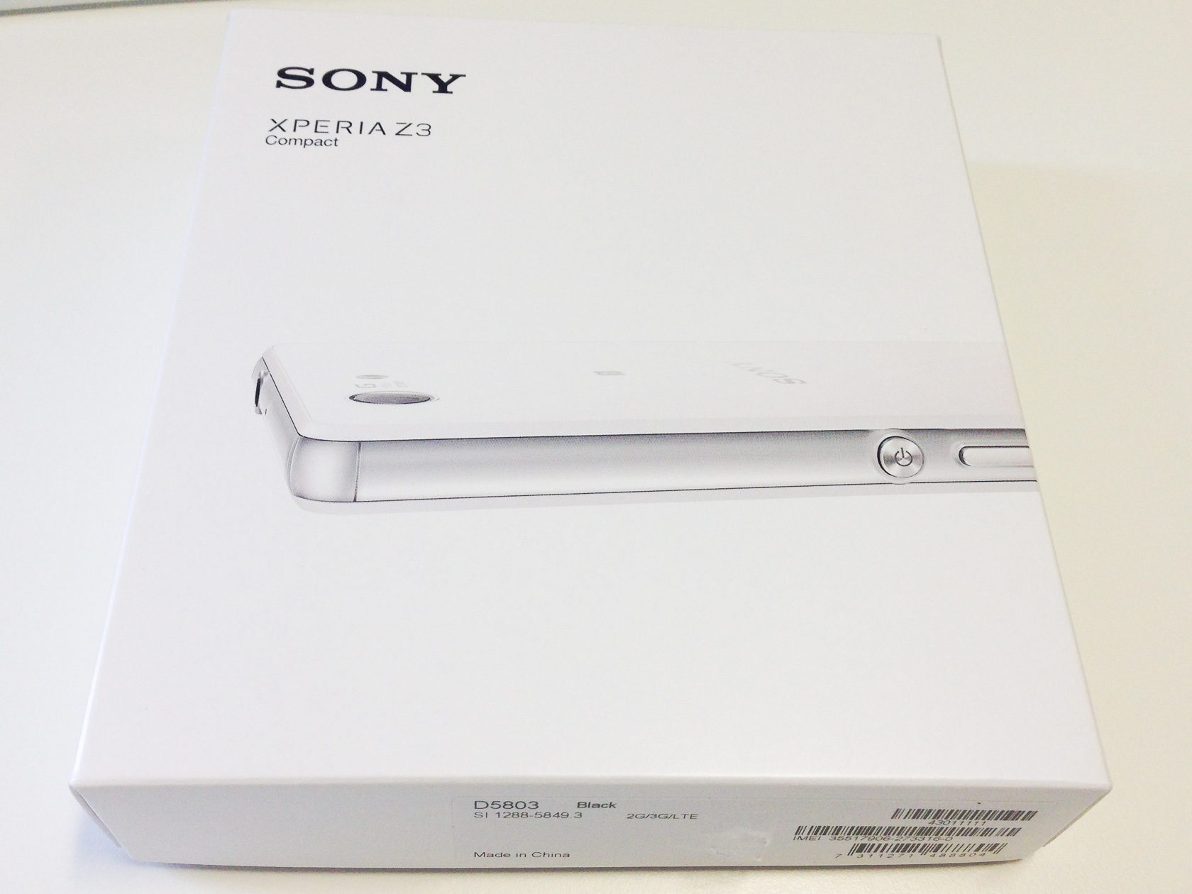
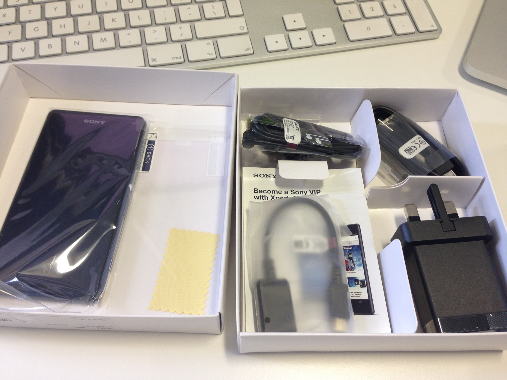
I ordered from Clove Technology, a mobile-oriented site that has been around a while now. What I like about Clove is that it’s run my enthusiasts – they have a regularly updated blog and do video reviews of handsets. There was also a screen protector in the box, which I’m pretty sure Sony wouldn’t include. It was an extremely cheap one though, after putting it on I removed it almost immediately and threw it in the bin!
The price was right, delivery was fast (faster than I expected for a brand-new handset), and included was a car charger and case, which I am yet to receive. But I’ve had two apologetic and unprompted emails explaining the delay, and I don’t really need either of them. So I can forgive the wait!
Included is the usual set of accessories – charger, USB cable, headset, manual. I was pleasantly surprised to see a USB host adaptor, you don’t usually see those included, and they are useful for downloading photos from cameras or sharing your own photos with others.
The only disappointment was the lack of a magnetic charging cable. Apparently, Sony expects you to open the flap every time you want to charge, which can’t be good for the waterproof seal.
Appearance
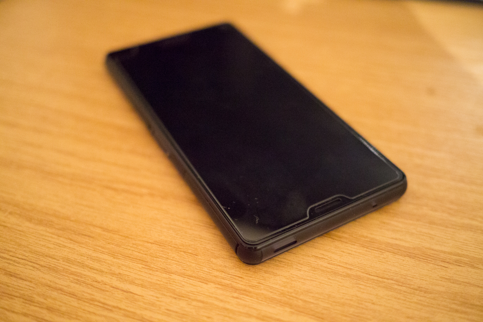
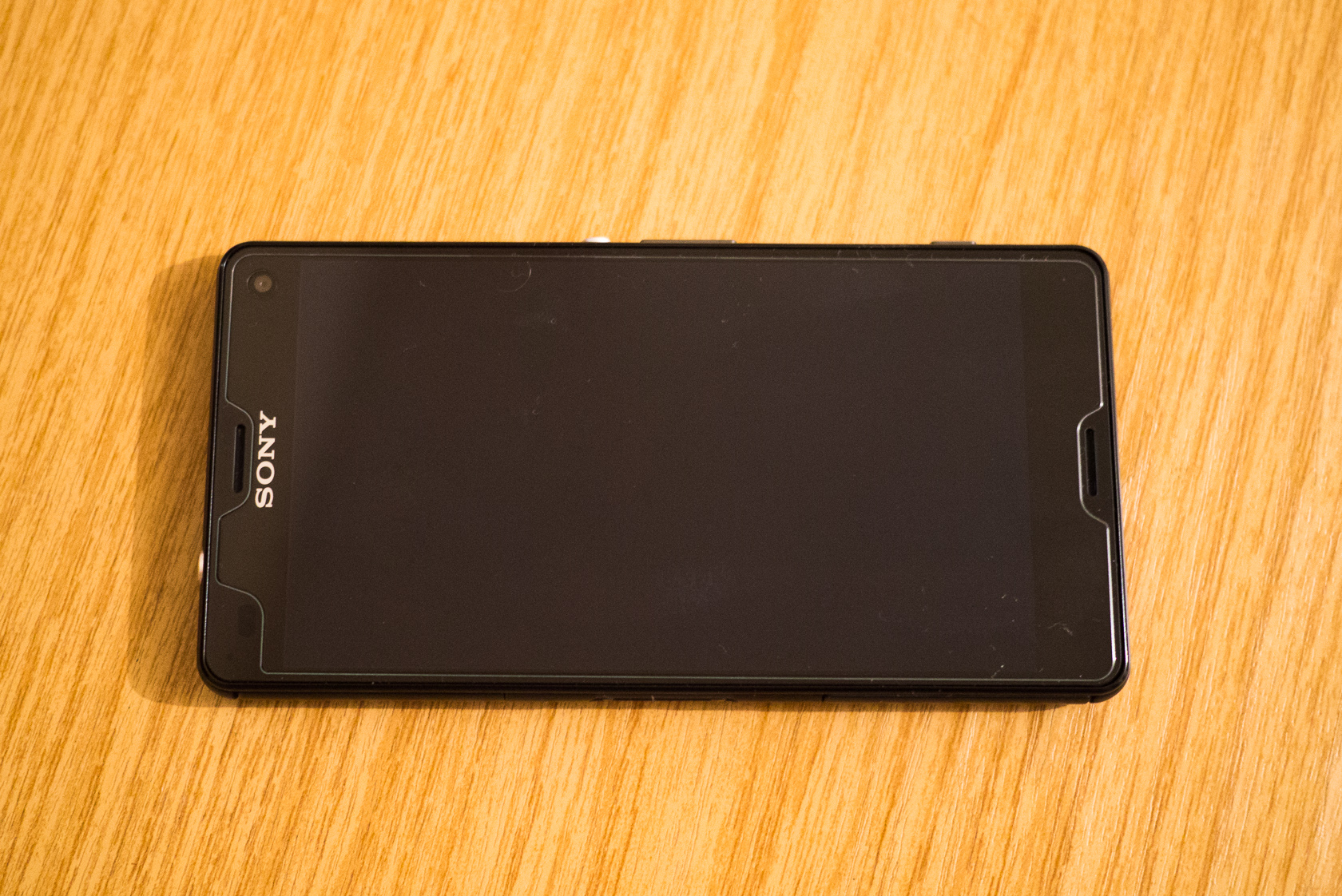
The Z3C strikes me as understated. It’s not too thin which gives it a strong, robust appearance. At first I wasn’t thrilled to see glass on the back, but it does have its advantages. Note, I’ve added a screen protector which is clearly visible.
Size and Profile
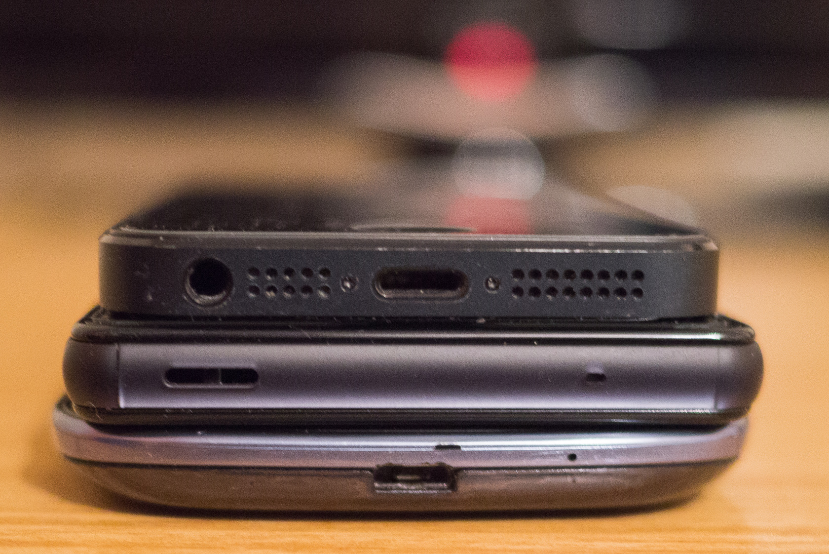
The screen size is very similar to the S3. Unlike the S3 though, it uses on-screen navigation buttons, and has smaller bezels, which makes it shorter. Here it is compared to an iPhone 5 and my old S3:
It’s not exceptionally thin, but that’s a good thing. It’s thicker than an iPhone 5, and the same as an S3, but not as tapered.
The S3’s curved profile means it feel thinner in pockets than the Z3C, despite them having the same thickness.
Handling
In the hand I find it very comfortable to hold. I don’t have a case for it yet, but naked it’s more comfortable than the iPhone 5 with a hard shell case (or without). The curved, plastic sides are a positive for ergonomics.
It’s much easier to pick up from a hard, flat surface than an iPhone 5, but harder than a 3GS or the curved S3.
One thing I don’t like is the placement of the power button. When held in your right hand, it’s in a fairly convenient location to be accessed by your thumb, but your thumb is for the screen, and you have to adjust your grip slightly to go between the screen and power button. When held in the left hand it is most easily accessed by your middle finger, but it is below were it naturally rests. I prefer where Samsung puts it – on the upper right side, where it can be easily accessed with an index finger.
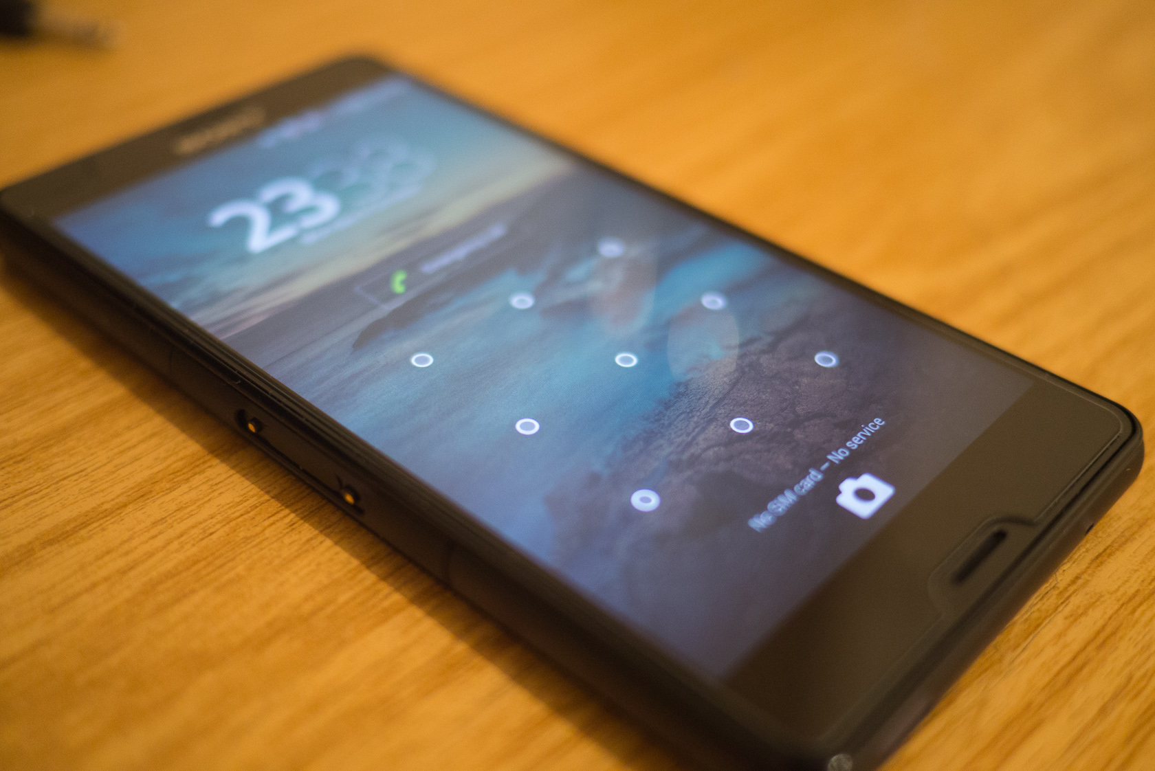
By default, the power button is the only way to wake the phone, but fortunately you can also enable ‘tap to wake’, which wakes the device with a double-tap on the screen. I’m sure I’ll get used to the power-button location with time, and the ability to reach all parts of the screen and use the phone one-handed certainly helps forget this shortcoming.
Display
It’s a LCD, and pretty darn good actually. Some may bemoan the lack of 1080p-class resolution, but a 720p display is a sensible, pragmatic design choice. 1080p displays cost more, consume more power and need more memory to drive them. And on a 4-inch device, the difference between 1080p and 720p is barely perceptible. Would 1080p display be worth the cost, power and memory trade-off? Not for something that fits comfortably in your palm.
I prefer the colour reproduction to the S3, but AMOLED displays are known for over-saturation. I miss the deep blacks though, and the knowledge that choosing a black background was increasing battery life!
Viewing angles and sunlight legibility are also excellent, and I find outdoor visibility better than the S3. Comparing a 2-year old AMOLED to a new LCD isn’t terribly fair though.
Software
First black mark.
Google-only Android is getting up there in terms of bloatware these days (die Google Plus, die), but Sony takes it to a level I haven’t seen since a 2000-era Dell desktop PC.
From blatant advertising offers, to not-so subtle reminders to use Sony’s various online features, to AVG Antivirus (!), to App, Music and Movie stores and just about every waste of space you could think of. This is the downside of buying a phone from a finger-in-many-pies company like Sony.
And of course, most of them can’t be uninstalled.
Thus over the first 24 hours of owning the Z3C I was constantly uninstalling and disabling Sony’s built-in apps. Maybe that’s why it’s relatively cheap (£360 is in the Google Nexus price range!).
I shudder to imagine what a carrier-supplied phone must look like.
It’s not all bad…
Besides the bloat, some of Sony’s changes can actually be useful:
- “STAMINA mode” does everything it can to extend your battery life
- The Xperia Connectivity settings menu supports Miracast, which has more industry backing the Google’s proprietary Google Cast
- The Camera is more advanced than most, so Sony’s Camera app adds value by having more control over the hardware
- Smart Connect can perform actions based on what device is connected and the time of day
- The Playstation Connect feature has the potential to be either cool or gimmicky
But really, that’s it, so this phone will be rooted as soon as it is practical. However there’s something to be aware of – rooting the device permanently erases encryption keys which are needed for some of the software and camera features (like remote display). I really don’t want to lose any camera features that could impact image quality or control over the hardware, but couldn’t give a toss about Sony’s DRM.
More research is needed.
Battery Life
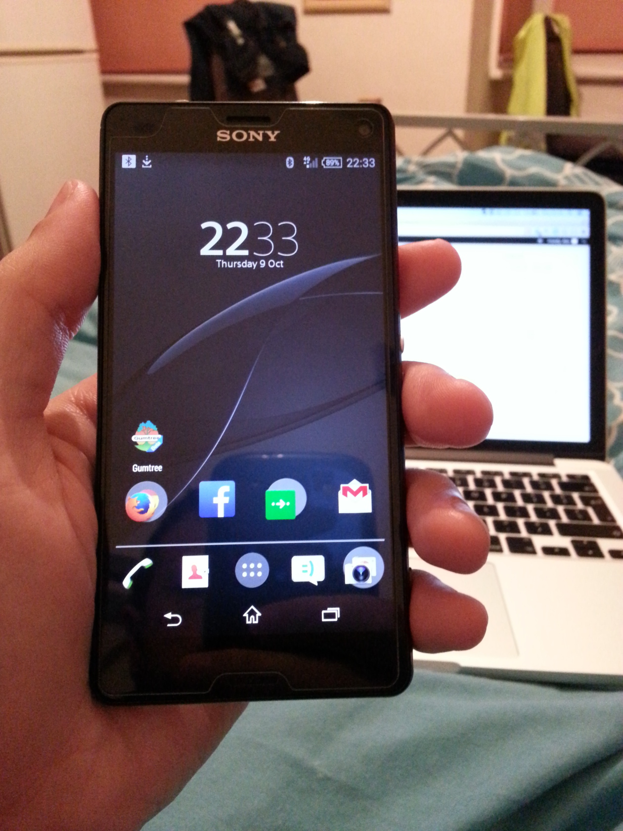
At this point, I still don’t have a sim card, so I’ve left WiFi on. With Facebook and most of my other daily apps in the background, and a rather extensive photo-session on a boozy thursday night, the Z3C was down to 35% after nearly 3 days. I’m fully aware that having a sim will cut this down significantly, but that’s still a rather impressive showing, and with my usage patterns I’m fairly sure I’ll be able to get 2 days per charge.
Camera
Being interested in photography, the camera of the Z3C was a selling point, and with a larger-than-usual sensor size, I had high expectations.
It’s been rather underwhelming.
Image quality in low light is good, and represents a step up from the S3, but the main disappointment is how wide the lens is. At 25mm equivalent (in 35mm ‘full-frame’ terms) it is far, far wide of 35mm, which is about the ideal for a walk-around fixed focal length lens. This means you have to get really close to get any decent level of detail, otherwise most images need cropping. Thus, part of the surface area of that large sensor is often wasted.
I would happily accept an iPhone-6-like camera hump if it meant a longer lens, and from a company with a large presence in the photography market, I expected better.
What a wider lens is good for is indoor social photography, which is a common use for phones. So I’ll reserve absolute judgement until I’ve used it more, but my initial impression is that while it’s better than average, the far-too-wide angle makes creative photography nigh on impossible (landscapes excepted).
Waterproofing
I haven’t taken mine for a dip yet, but I have a friend who swore off Sonys after his Z1C died in his pocket while kayaking.
Kayaking is a very reasonable use case for a waterproof phone, but as with waterproof cameras care must be taken to ensure the seals are watertight. If dust and grit get in the way, those seals are no more waterproof than a lunch box.
For this reason, I’d strongly suggest using only magnetic charging cables if you plan to take advantage of this feature. Or in the very least, clean out the port covers and ensure a tight seal before getting wet.
It’s also inconvenient to open the flap for charging anyway, so magnetic cables make sense, which makes it all the more baffling that Sony doesn’t include one in the box.
Other Notes
If you see the cheap magnetic adaptors on ebay, don’t get the ones that connect perpendicular to the phone. In order to charge the phone with one of these you need to lay it on a dead flat surface with zero vertical leverage or it won’t hold at all. The right-angled adaptors work better, but best of all is buying the whole cable, as this minimises the weight on the phone end.
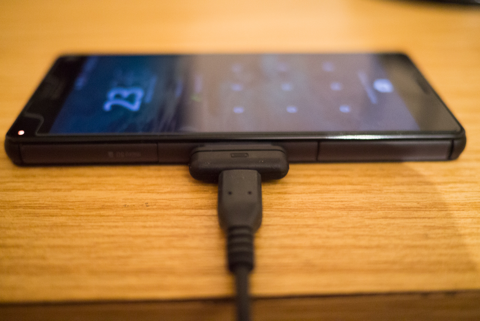
]14 Don’t buy these
Conclusion
Impressed, underwhelmed, but overall satisfied are the reactions I’ve had while using this phone. It strikes me as a reliable work-horse, pragmatically designed for the real world. It’s a better device for it, but it doesn’t have those fancy features or party tricks that would make all your friends want one.
And that almost makes it boring.
I don’t really mind though. A smartphone is a utilitarian device, and the more it gets out of my way and lets me do what I want, the more I’ll appreciate it in the long run. The Z3C then, is as close as I can get to my ideal phone.
What would I change? Don’t kill phone features when rooting. Remove the bloat, make the lens longer (~35mm-50mm ideally), and raise the internal storage to 32GB. An AMOLED screen would also be nice. But really, the Z3 Compact is the most well-balanced phone I’ve owned, and nowhere near the most expensive.
Good:
- Excellent battery life, quite possibly the best you can get in a 4-inch smartphone
- Water resistance is a handy feature
- Camera is better than most in low light
- Micro SD slot
- Magnetic charging enables nice dock solutions
- Flagship performance in a phone that’s comfortable to use one-handed!
- A phone engineered to be used, not just to sell
- Represents very good value at £340 inc VAT
Bad:
- Camera lens is very wide, much wider than a general-purpose fixed-focal length lens should be
- Egregious Sony bloatware
- 16GB of internal storage is low in 2014
Ugly:
- Irretrievable DRM keys, and so far little support from the homebrew / hacking scene



Are you satisfied with Sony products?