I’ve had to think long and hard about this review. The N900 is unquestionably flawed, but it’s a leading edge device, and prescient in so many ways. It shows promise of things to come, and that promise is exciting. So does one knock it as a failed attempt at reclaiming the smart phone crown, or praise its foresight and anxiously await N900+1? Considering Nokia’s stance on the device it would perhaps be unfair to call it an attempt to retake the smart phone crown, as they never positioned it as such. But it does not deserve unreserved praise either.
To get my own personal bias out of the way – I want to love the N900. It’s a Linux-based smart phone built on open source software that doesn’t try to hide its roots. I’m a Linux geek and open source enthusiast. I dislike walled gardens such as the iPhone App Store and the artificial restrictions placed on the iPhone, so a 3GS was never an option. Android is a bit too tied to Google’s services (a company which already knows much more about me than I would like to admit), and while Nokia are certainly trying to push their Ovi suite of services, they would be foolish to make it difficult for you to use competing services. My credibility as a reviewer drops somewhat given my lack of experience in using Android, and quality time with an iPhone. I’ve had a play on devices owned by friends, but that’s not enough to get to know the ins and outs of a device.
So it’s with a bit of trepidation that I review the N900. My only real frame of reference is the aging Symbian S60 – an OS that has served us well, but is now past its use-by date and hardly the ideal operating system to compare it to.
Physical Presence
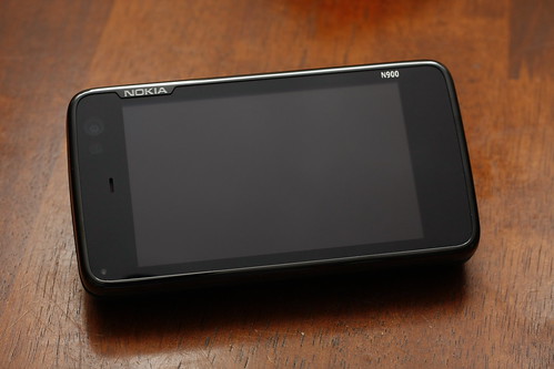
Nokia have many, many years of experience in building handsets, and it shows in the N900. It’s well constructed, the buttons have a good tactile feel and the screen operates well. Other reviewers have commented that the slide out keyboard doesn’t feel as solid as other handsets, including Nokia’s own N97. Unfortunately not having used other handsets with slide out keyboards I can’t comment on this, however it feels solid enough to me. There’s no wobble to speak of and it makes a reassuring click when slid shut.
There’s a little stand at the back, which is so flimsy as to be almost worthless. It might be useful if you want to use it to watch video (a 3 inch screen is too small no matter how high the resolution), but any interaction is out of the question as the pressure required to register a press feels similar to what it might take to break the stand.
Perhaps the biggest downside is the thickness and weight. I’m coming from a Nokia N78, which at 101g is rather svelte by smart phone standards, in fact even today it’s hard to think of a smaller device with comparable features. The surface area on top is very similar to other smart phones like the iPhone, but the N900 is the chunkiest handset I’ve used since I had a Nokia 5120 back in 1999 (the link is to the 5110, but the 5120 was physically identical, it just worked on Telecom’s old 025 network instead of GSM). In fact at 181 grams it weighs even more than the 5110 (170g), and makes my E61i seem positively light (which at 150g is really not light at all). The iPhone by comparison is 135g.
This is not a device you take everywhere in your pocket without a second thought, this is a device you leave behind when you don’t need to carry the internet with you. I wouldn’t dream of taking it with me on a night out, so it looks like I’ll be keeping a second phone around to swap the SIM… which reminds me of a point about SIM cards which I’ll come back to later.
Operating System
Just a few years ago the operating system running on a handset was all but irrelevant – now it’s the bullet point that determines more about the capabilities of a phone and how it operates than anything else. If you’re reading this you’re probably aware that the N900 runs a Linux-based operating system called Maemo. A full review of Maemo is way beyond the scope of this article, suffice to say it is the main strength of the N900. It is a proper Linux distribution which is designed for small touch screen devices, is open source, and looks positively gorgeous.
Desktop
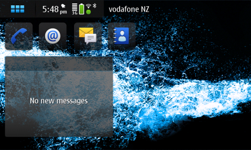
The first thing you need to know about Maemo is that it’s currently very much a landscape OS. While most handsets operate vertically, Maemo devices will have you using them horizontally 90% of the time. Currently the only two official applications that support portrait mode are the Phone/Dialer and the Web Browser, although in the case of the web browser this is a semi-official hidden function! (you need to press Ctrl-Shift-O to activate it).
I find the rotation animation a bit kooky (for want of a better word). It doesn’t seem to bear any relation to what’s actually happening, unlike the iPhone’s rotation animation. Portrait mode feels like an afterthought, and this will need to change for more mainstream devices.
The desktop gives you four virtual desktops, and they work similarly to those on a standard Linux desktop, except they’re OpenGL accelerated and you move between them by swiping your finger across the screen. I found four to be too many, so I disabled one only to find it had removed the one that had all my icons on it. Reinstating it did not bring the icons back either, it was blank! So if you don’t want 4 desktops, be sure to disable any unwanted ones before you start loading icons and widgets onto them.
Connectivity
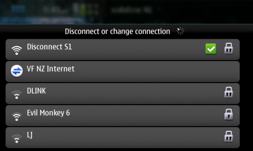
The OS intelligently switches data connections when appropriate, i.e. if a configured wifi connection comes within range it will disconnect the HSDPA data connection and use the much cheaper wifi. The first time you connect via HSDPA data it asks whether you want to use it automatically when no wifi connections are in range, which is a very nice touch. If you do not grant permission you need to manually initiate the connection to use it, which I find to be a big improvement over Symbian. On S60 you had the choice of allowing everything to use it automatically or manually confirming each and every access, which was positively annoying.
The desktop environment supports signing in to several types of accounts. As shipped these include Ovi, Skype, Google talk and SIP. If you install some extra plugins from the development repository, you gain support for AIM, Facebook, Gadu Gadu, Groupwise, ICQ, Jabber, MSN, QQ, Sametime and Yahoo (some of these I’d never heard of). The accounts you setup integrate with some of the more important built-in applications, notably “Phone” and “Conversations”.
Overall the connectivity of this device is quite outstanding, and best of all it does not restrict what you can do over particular connection types, unlike the iPhone Skype debacle.
Applications
Not surprisingly for such a new platform, applications for the N900 are a bit thin on the ground (to say the least). The Ovi store is a bit of a joke at present, as illustrated by the fact that “Proverbs 3:5,6 – MMS” is on the “recommended” list! One has to wonder what an application has to do to get recommended, as this appears to be an app that sends MMS messages on a device that doesn’t support MMS (maybe this is inaccurate, but I’m not about to spend USD 1.00 to find out).
The selection of free open source software is quite impressive, but many of these are direct ports of software that was designed for other platforms. Some things just weren’t designed to work on a small touch screen – two notable examples being Scummvm and DOSBox. Still, if you want to put in the time you can use them. Some software was designed for the older Maemo tablets (N770, N800, N810), and since those are similar devices these applications can be a bit more usable.
An OS is only as good as the apps that run on it, so in the sections below I’ve made some comments about some of the more important applications you’ll use on Maemo.
Phone
The N900 is a very service-agnostic device which is fantastic. In the phone application, SIP and Skype calls are treated with equal prominence to standard telephony calls. For us in New Zealand this is useful when you’re at home, but when roaming about it’s a bit ahead of the curve. Using Skype over 3G isn’t practical yet as the data costs are a bit high, but in the future this will change.
Notably absent is video support. I was rather disappointed by this, as the idea of Skype video calls on the N900 appealed greatly. Traditional video calling over the carrier network is also unsupported. This is a very notable omission given the number of other handsets support it, and the hardware is there (the N900 has a front facing camera). Reading the forums I get the impression that this is a high priority for Maemo, so I would expect to see it in an update later in the year. Hopefully we don’t have to wait until Maemo 6…
There have been some reports of video calls over Google talk working, but I’ve never used video chat over Google Talk – I want Skype!
Contacts
I love this. The Palm Pre introduced to us the idea of an integrated contact list which aggregated contacts from multiple sources. The Contacts application in Maemo lays the foundation for a similar system, but to really make it sing you need a third part application called Hermes.
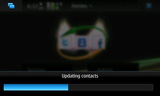
Hermes is a small app that matches your existing phone contacts with your contacts on Facebook or Twitter. Once matched, it updates the contact details for them, and downloads their profile pictures to represent them in your phone book.
It seems to be really conservative and doesn’t match any that aren’t a clear match, but you can see the unmatched contacts in your phone book and manually link them to online profiles. Be careful though, as at present Hermes does not support removing the links, so you will probably have to delete and recreate any contacts you mess up.
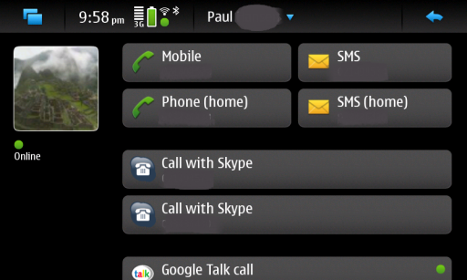
Below is an example contact screen (with the obvious editing out of personal details). On my Symbian phone, this contact was a simple contact with a cell phone number and home phone number. The picture was pulled from this friend’s Facebook page, and the Google Talk details were merged from my Google Talk contact list. Off screen below are web page and birthday information from Facebook, and MSN account details merged from my MSN messenger contact list.
It does take a bit of manual merging of contacts from various sources (I had MSN, Google Talk, Skype and of course legacy phone book entries), but the effort is well worth it as you can then pull in the supplementary information automatically from Facebook with Hermes and have a truly unified contact list. But more importantly you have an easy way to contact them through any available protocol.
Conversations
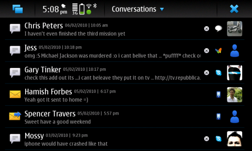
This replaces the “Messaging” app on Symbian devices. It operates completely differently, but definitely in a good way. As the title hints at, messages are organised into conversations, and these conversations can be IM sessions or SMS messages. In my opinion it’s rather brilliant, and works in such a way that you don’t have to care about what service you’re using – the conversation takes the lead here.
Other than that it is fairly basic but does the job without getting in your way. It doesn’t handle email, that is reserved for a separate email application.
Web Browser
The web browser has been reviewed extensively on other sites. While it is one of Maemo’s strengths, to be perfectly honest I don’t find it that exciting. Web sites are generally designed to be viewed on desktop web browsers are don’t work well with touch screens, particularly 3 inch touch screens. You really have to use the stylus if you want to click on any links, and to me mobile computing should be done with nothing but your fingers. Sites that are designed for mobile browsers are generally portrait orientation and designed for much lower resolution than 800×480, so you end up with tiny text on the left side of the screen. Anything else is designed for a much larger screen, so Maemo is in a funny middle ground.
Of all mobile phones it undoubtedly gives the best experience on normal sites that were designed for desktop use, but the overall experience is still quite poor in my opinion.
Once more web sites are designed for 800×480 pixel 3 inch screens I might be inclined to revise my position, but for now I’m placing web browsing on the N900 firmly in “only when you need to” territory.
Maps
This is a bit of a disappointment. Ovi Maps on the N900 is online-only, that is you can’t preload maps like you can with the Symbian version. I can somewhat understand the rationale behind the decision given that connectivity is increasing, and the main competition (Google Maps) is all online, but I don’t have to like it. The other reason behind this decision may be that you can’t provide up to date business listings/advertisements without being online, or is that just my cynicism showing through.
I have tried it out, and the experience was quite positive once I got used to the user interface. I couldn’t find any graphical turn by turn navigation, but routing worked reasonably well, and gave me an accurate list of directions.
So overall, mapping and navigation on Marmo seems to be a step backwards. S60 had Nokia Maps, Google Maps and Garmin Mobile XT which were all quite good, although I hated how Nokia Maps randomly rotated the screen when you weren’t moving (it caused me to make a wrong turn on at least one occasion). Maybe I will give Ovi Maps on the N900 a better shot, and the open source Navit looks promising as it can use Open Street Maps. It is a little tricky to configure though.
Music/Media Player
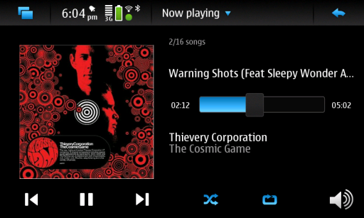
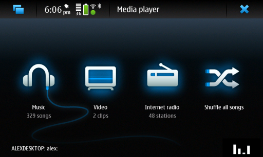
In short it’s attractive, easy to use and it works.
The music player on Symbian (at least on my N78, which isn’t all that old) is quite frankly poor. It’s unstable (easily tripped up by slightly incorrect files), doesn’t play anything other than the most basic formats (MP3/WMA/WAV), and is slow to operate. The Media Player on Maemo is a huge breath of fresh air, and it had to be given the heritage of the competition – the iPhone is an outstanding media player, but in my view Maemo stands up to it very well.
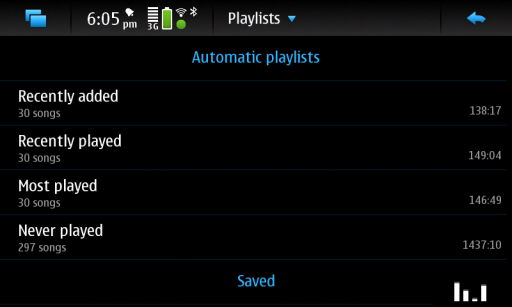
So what’s good about it? The interface is built for touch screens. It supports a broad variety of media formats which can be extended via plugins – particularly OGG support, which is in the stable repository. It supports UPNP shares (of questionable utility right now but we’ll see…). It has dynamic playlists, including an extremely useful “Never Played” option – which means I never have to listen to the same thing twice, and also recently added etc. Creating and saving playlists is extremely easy.
Out of the box the FM transmitter is a little weak – I had more interference problems than I did with my N78. The frequency selection also isn’t as granular – on the N78 you could choose a frequency to the nearest 0.5mhz but on the N900 it’s the nearest 2mhz. There is however a script (FM-Boost) and desktop widget called “Simple FMTX desktop widget” available (in the extras-devel repository, actually it may have been promoted to extras-testing by now), which helped a lot. This boosts the transmit power, and it made a big difference for me. Whereas before it was barely usable it’s now almost flawless.
If you’re wondering about a good frequency to use, I recommend checking out wikipedia – I found a list of radio stations in Auckland. From there I found that 105.7mhz is rather isolated, and that frequency has been working very well for me. The default (107.9) is a bit too close to Trend FM, which seems to play annoying loopy music that was giving interference of a regular staticcy rhythm.
Firefox
The “killer app”? Well maybe not but it’s the closest thing the N900 has to one. Firefox mobile doesn’t do flash, which in my opinion is a very. good. thing. The interface is noticeably slower than the default Nokia web browser, although javascript performance is reportedly up… Personally I prefer snappy browser controls to 30% faster javascript.
Firefox mobile will only improve, but for a more detailed look check out Arstechnica’s write up.
Misc
There’s a flashlight! It’s in the extras repository, and is simply called flashlight. One thing that bugged me about the N78 is that you simply couldn’t use the camera’s LED flash as a light unless you also made a video. Fortunately you now can if you install this app on the N900, just remember to open the lens cover or the option doesn’t show up!
Battery Life
Poor, this is simply not good enough. Coming from the E61 which gives me about 4 days of regular to heavy use and the N78 which gives between 3 and 7 depending on whether I use the GPS and music player, the N900s battery life is a massive, if not totally unexpected, disappointment. With my current desktop setup I’m getting just 1 and a half days of light use – with maybe a couple of hours of interaction thrown in there.
I charged it almost exactly 24 hours ago, and the battery is at 40% after about 30 minutes of RSS reading, 10 minutes of IM/texting, and 2 hours of music playing with the FM transmitter.
Choice of desktop widgets can have a big impact and the number of accounts you connect, whether you use wifi etc. Yes the poor battery life is my partly fault, but it does highlight the fact that we need to be able to perform some things more efficiently before they become practical in a hand set.
Camera
The camera is standard fare 5MP – nothing to write home about. The sliding cover is appreciated vs the N78 which had no protection whatsoever. Subjectively I think the photos are a noticeable improvement over the N78 (which is 3MP) as well.
Conclusion
The N900 is not for everyone. In fact I’d go so far as to say it’s for hardly anyone. Business users will be put off by the immature software stack and poor battery life. Casual consumers will be put off by the size, weight and lack of applications. This is a phone for geeks that like to tinker and live on the bleeding edge. It’s the best open source phone there is, and the only phone I know of other than the Open Moko that has no “anti-features” (artificial restrictions) built in. But just like running Linux on the desktop, these freedoms do come at a price, and that price is applications.
I have no doubt the software stack will improve immensely over the next few years, but Maemo has a tough battle on its hands against Android and iPhone OS.
Remember the comment I made about SIMs earlier? Well one of the biggest annoyances is that I have to carry two phones. Why is this? Because I have a personal mobile number and a work mobile number. But why does having two phone numbers mean I have to carry two devices? Because they’re tied to the SIM card, and each SIM card needs a contract. Effectively Vodafone is earning two incomes from me.
The beauty of devices like the N900 and those that will come after is that it brings sanity to mobile communications. Work calls can all be done over VoIP (when they get around to deploying it), and since the N900 supports multiple accounts I can link all my phone numbers to one handset. I will no longer have to carry two devices, just one that can connect to my companies SIP server and my personal Skype account. I wouldn’t have to swap SIM cards around when switching to a smaller device – I can just sign on to my VoIP account from the more compact handset, while still keeping the larger and more capable handset for work.
The N900 supports multiple email inboxes and multiple calendars – keeping work and personal data distinct while giving the convenience of having everything in one handset. It would even be possible to automatically sign off from your work’s VoIP server at a specific time each day – you wouldn’t even have to remember to switch off your phone!
So while imperfect, the N900 has given me a glimpse of the future of mobile communications, and I really, really like what I see. The problem is, I can’t take advantage of it yet. Purchasing one today is probably not the smartest move in a practical sense, but it sure is cool, and the gadgety factor can’t be ignored. The N900 is one hell of a device, but unless you can make use of its VoIP features it’s a bit ahead of its time.

Fantastic in depth review